Elizabeth on Seventh
Elizabeth on Seventh
Project Details
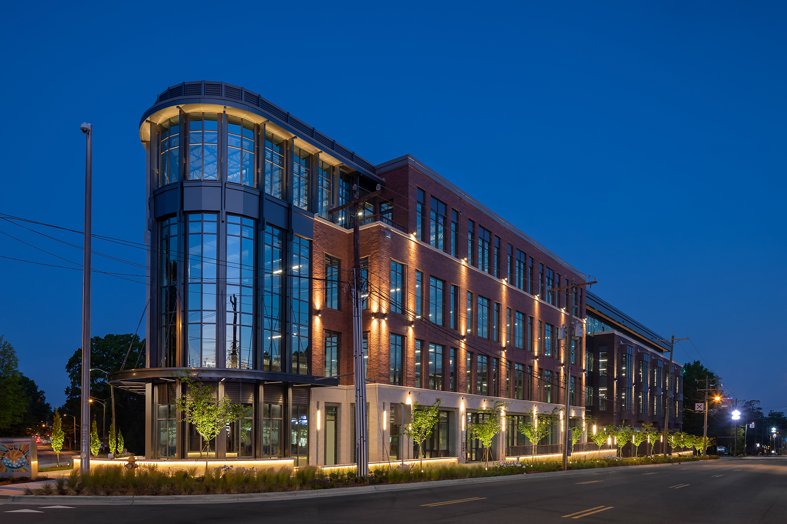
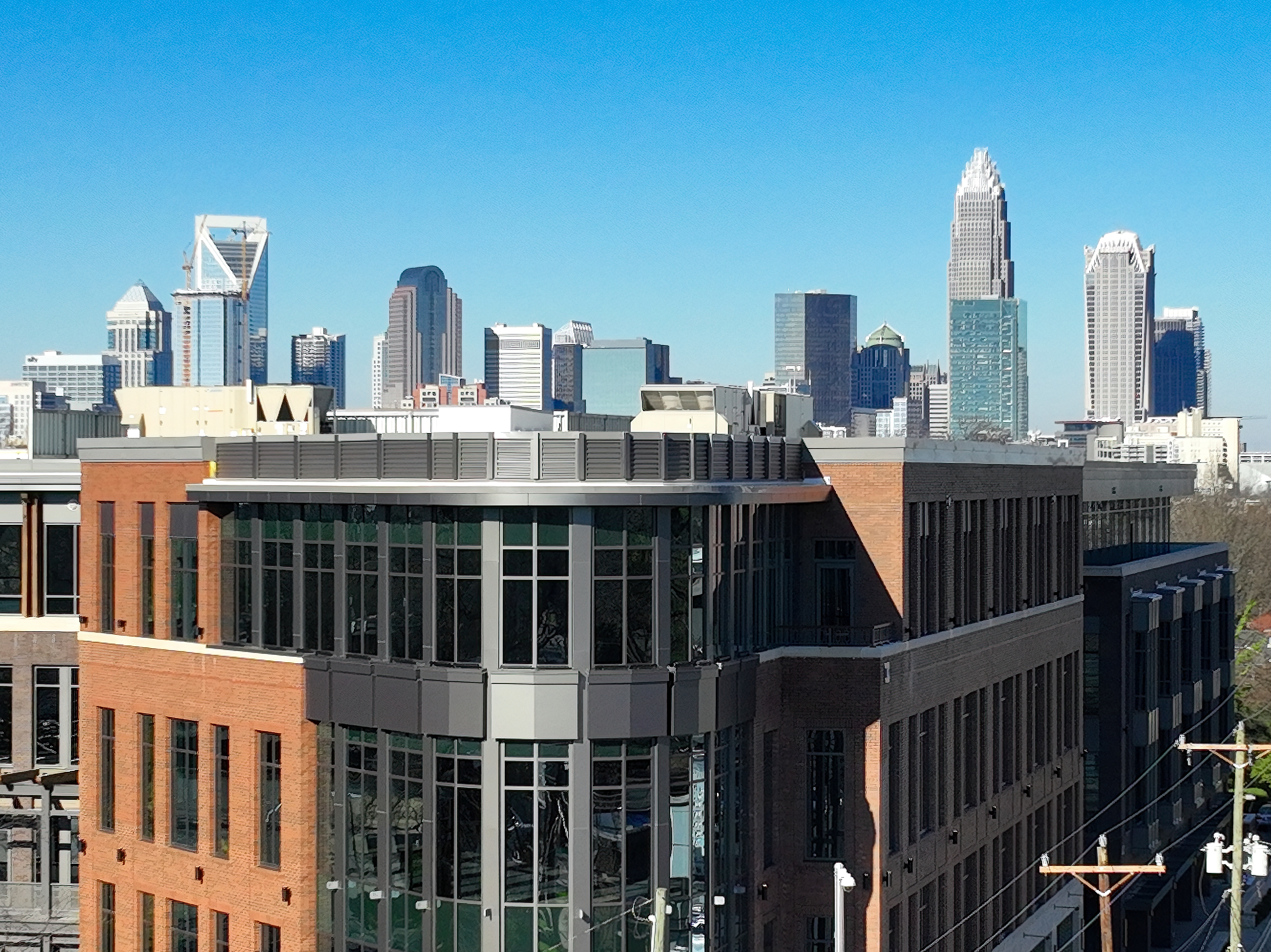
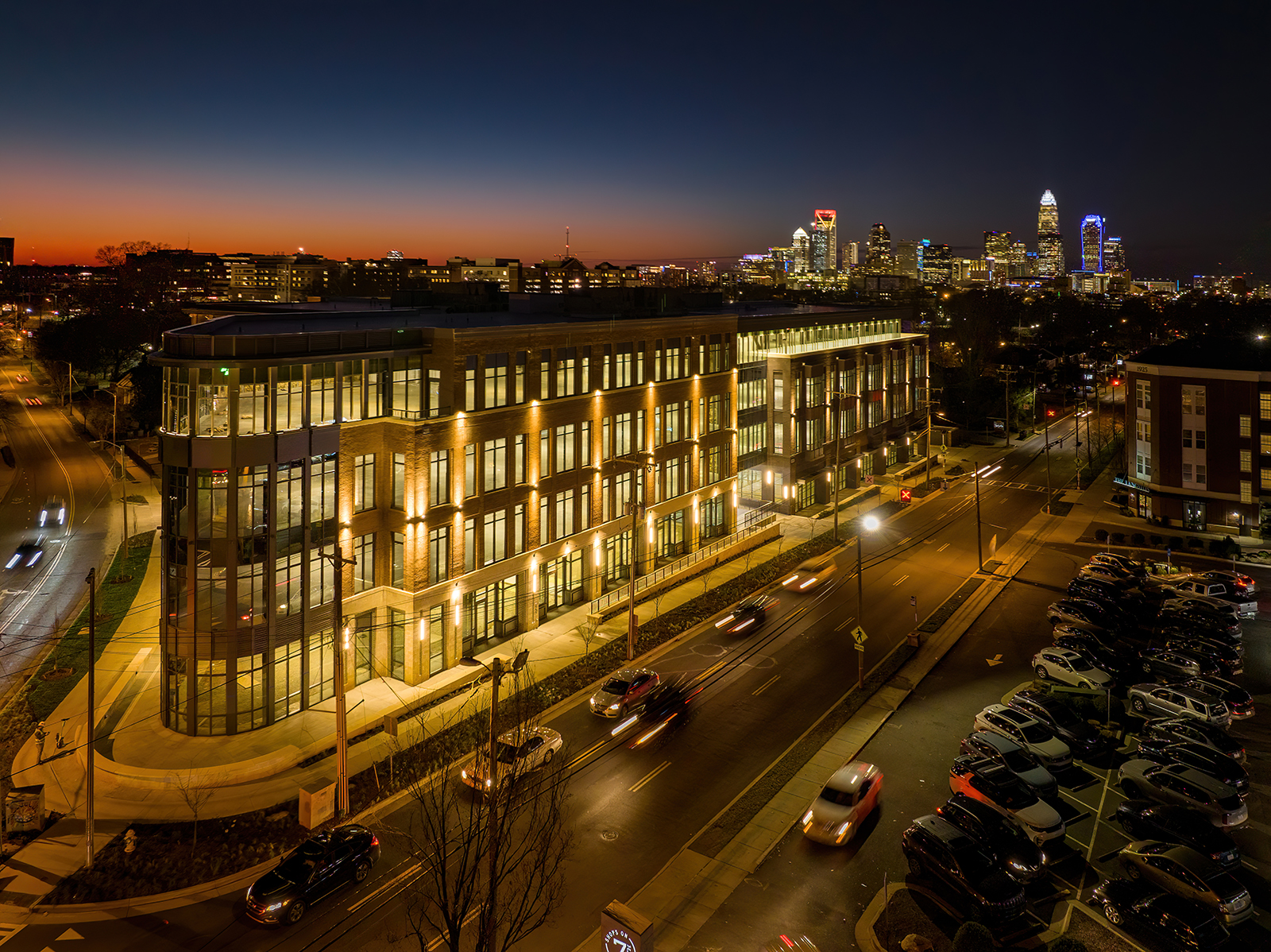
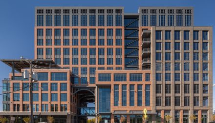
There are some project sites that are so fundamental to their neighborhood, that it is hard to separate the building from the community. The Elizabeth on Seventh mixed-use project holds such responsibility while offering 103,500 SF of Class A office and retail space to create a strong local opportunity to live, work, and play. Given the site’s location at the center of the historic Elizabeth neighborhood and anchoring the most prominent corner of its “main and main” intersection, the project could not be more critical to the fabric of the neighborhood.
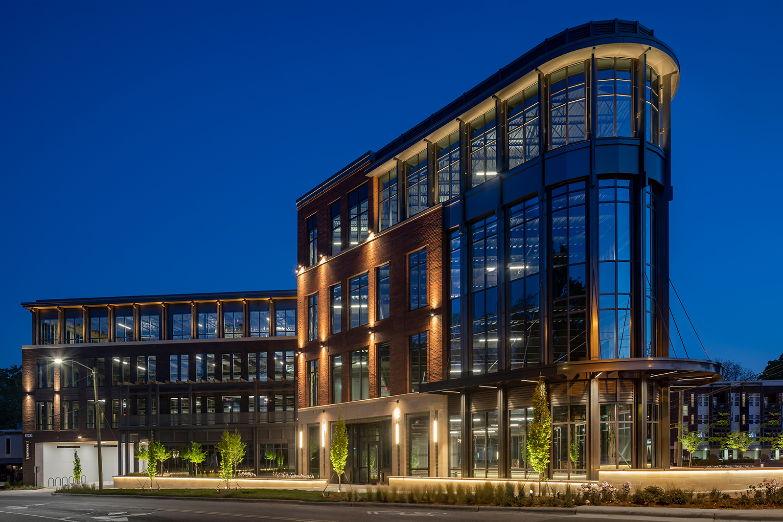
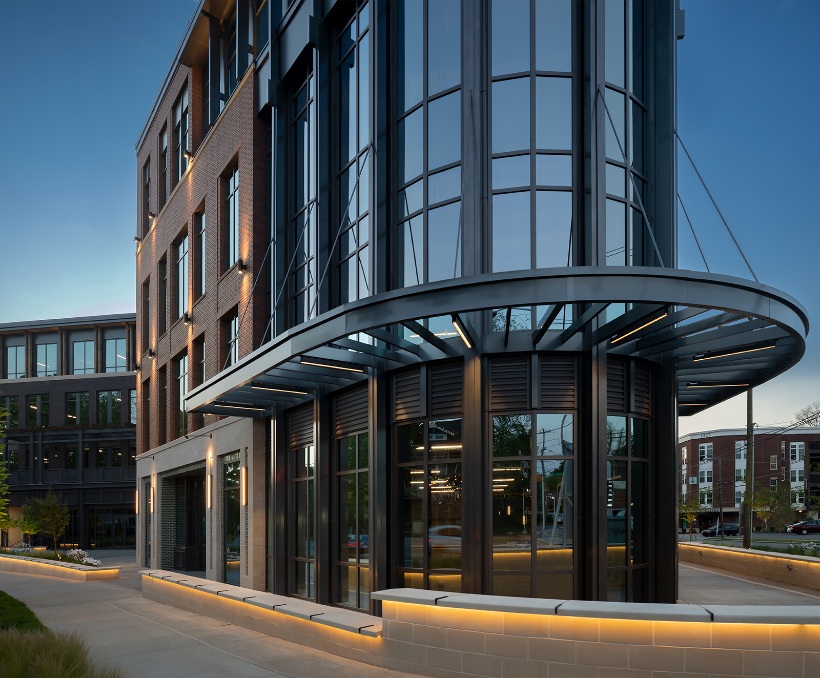
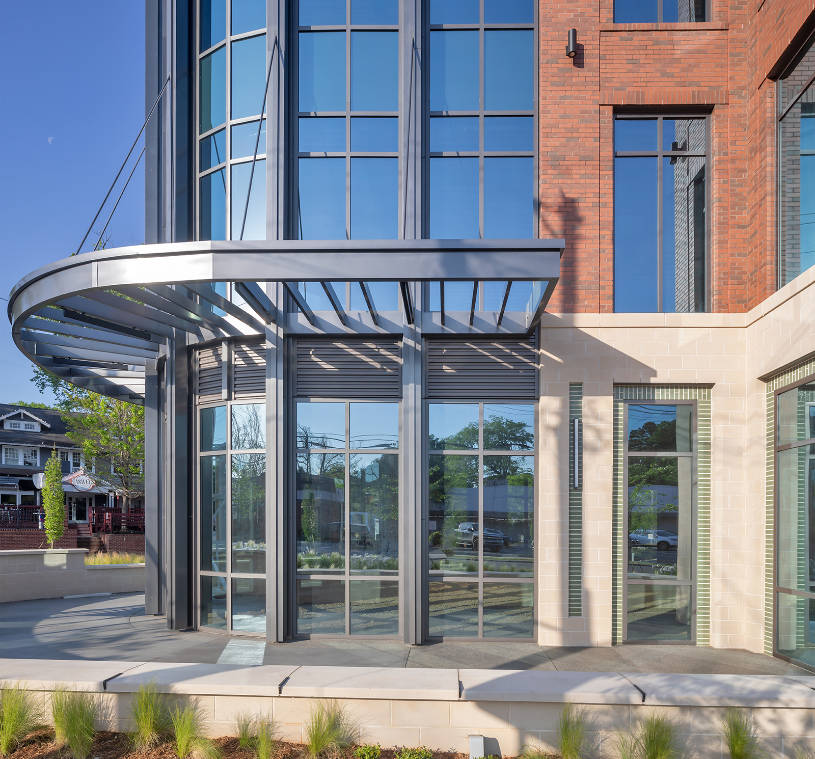
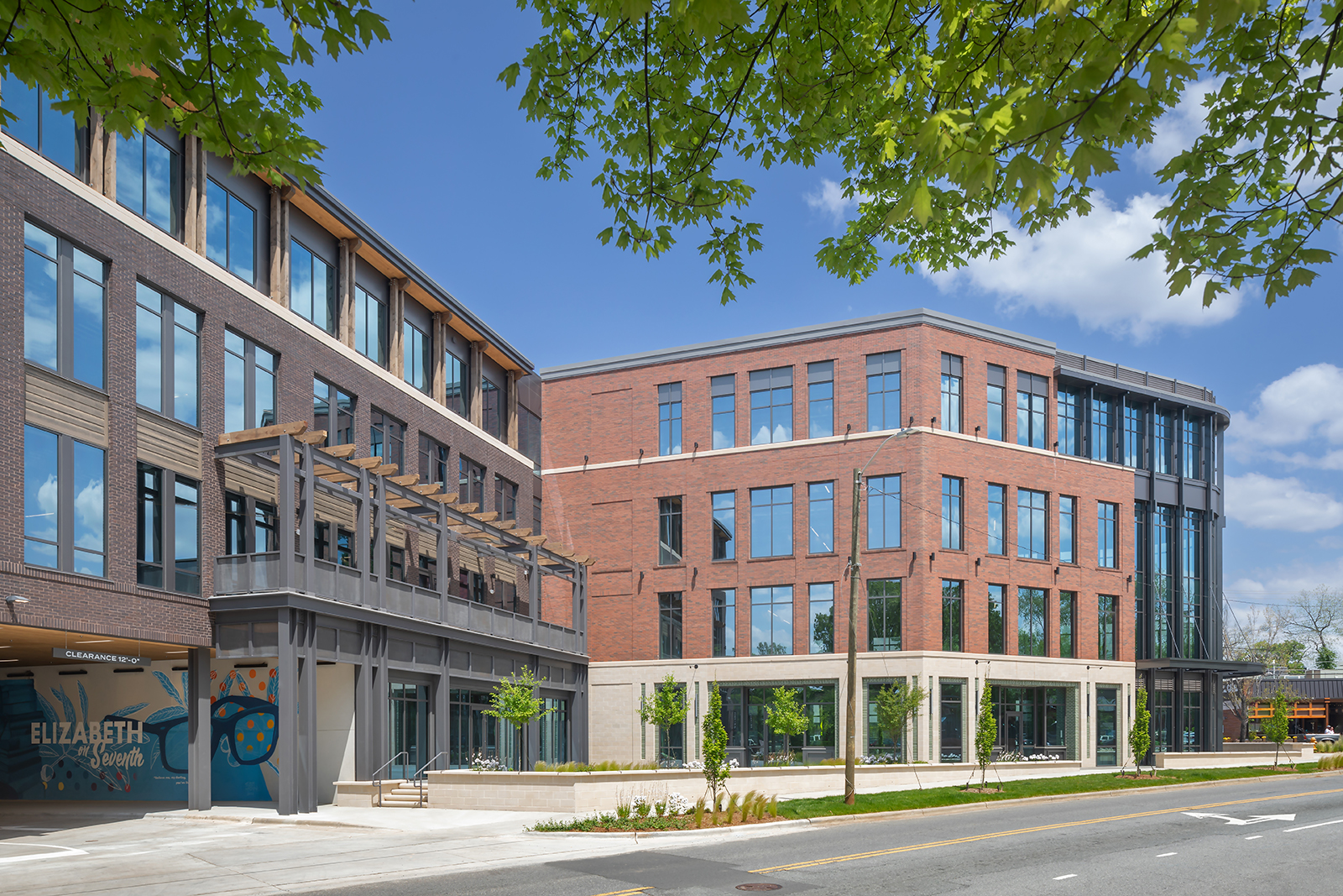
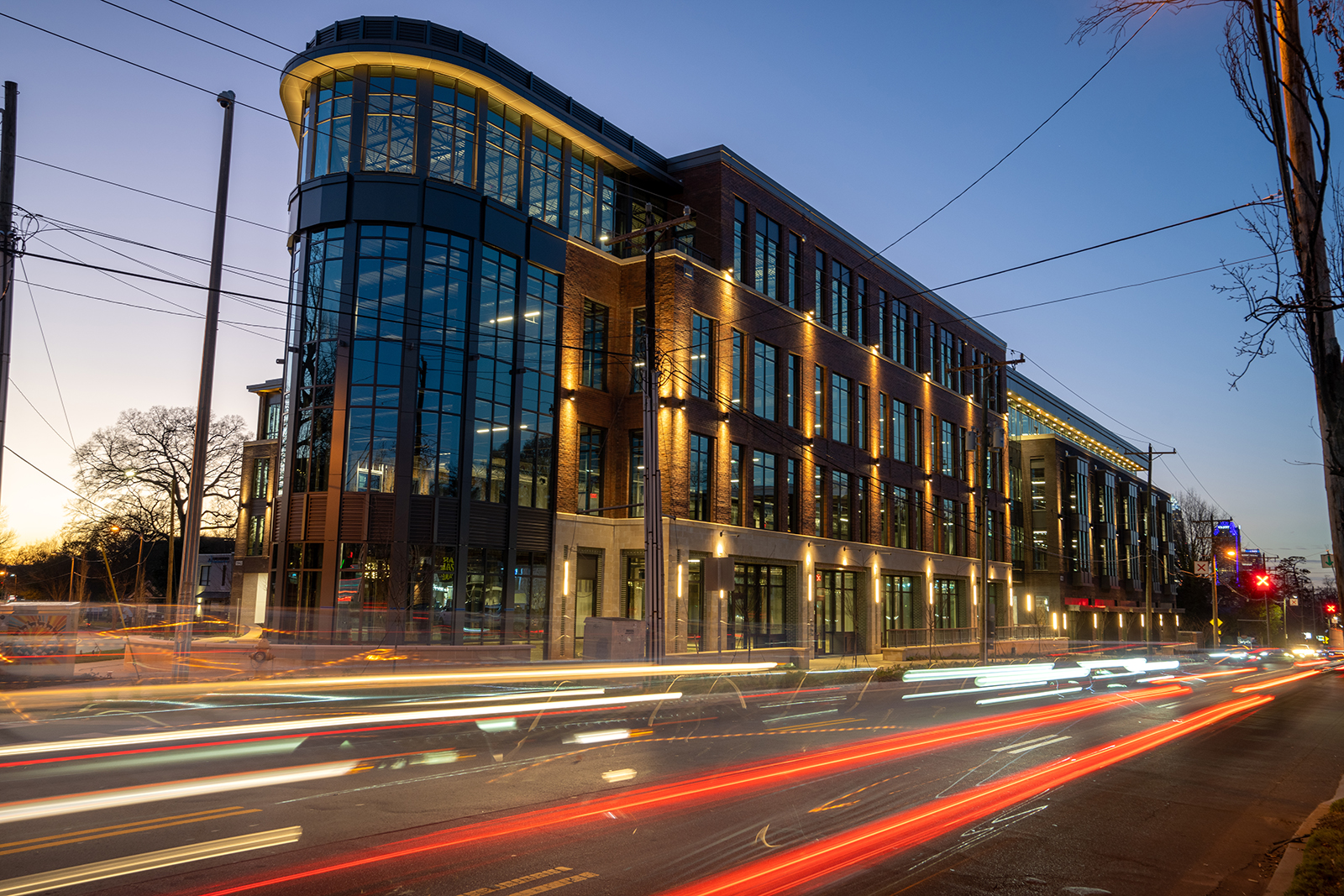
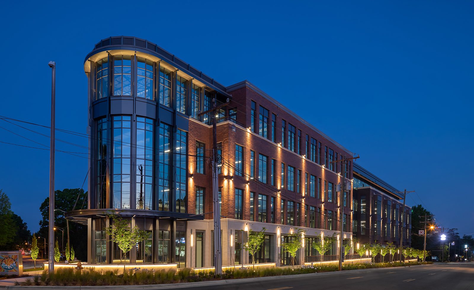
Elizabeth on Seventh’s design was driven by the site’s unique angularity at its primary corner – an acute angle created by the Caswell Road and 7th Street intersection. The building celebrates the corner with a heroic prow and pedestrian plaza, creating a “front porch” for the neighborhood of Elizabeth and announcing its own identity.
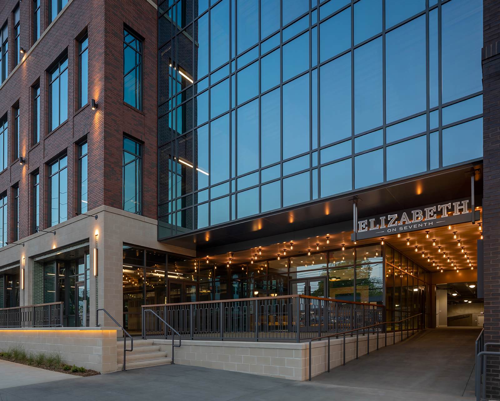
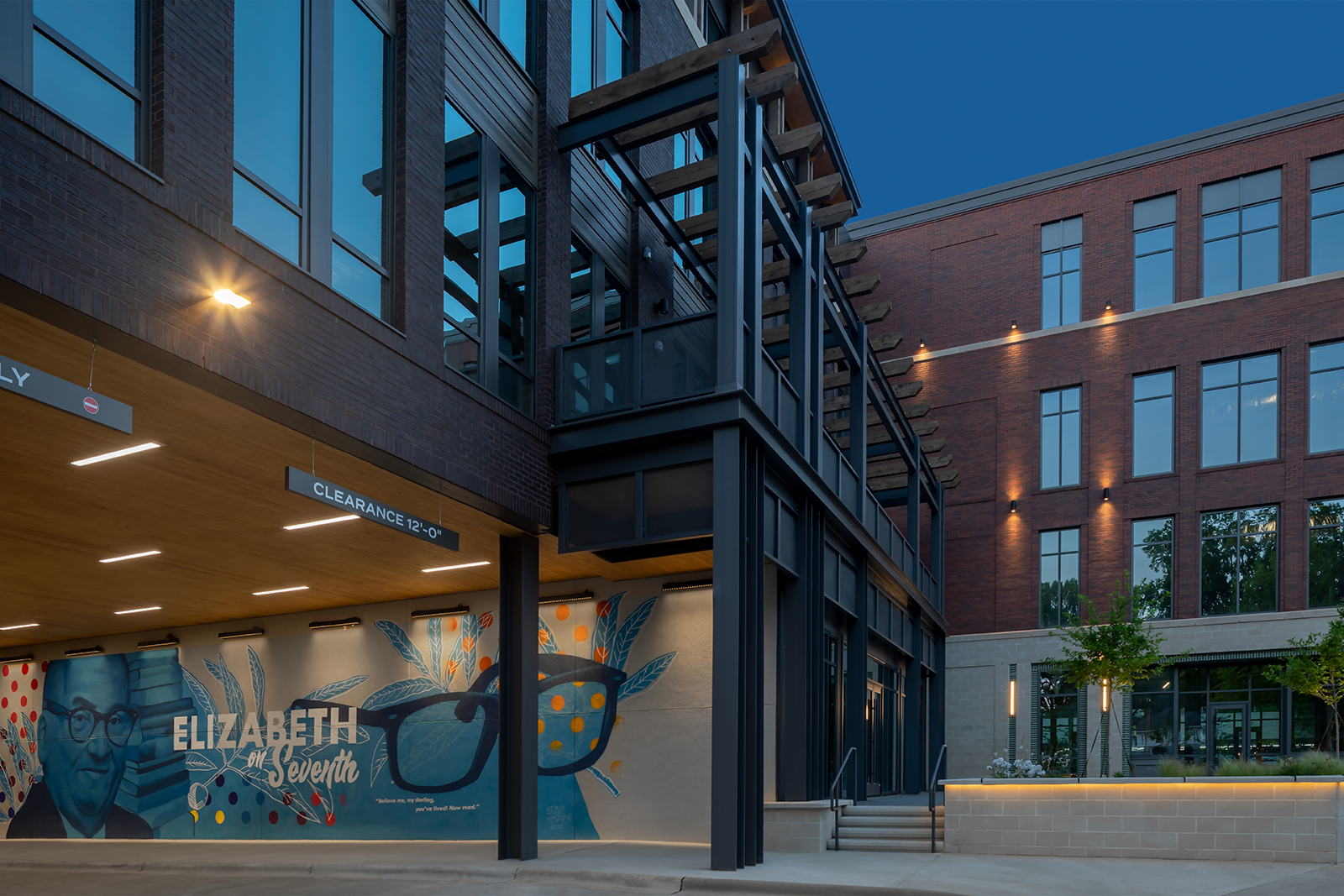
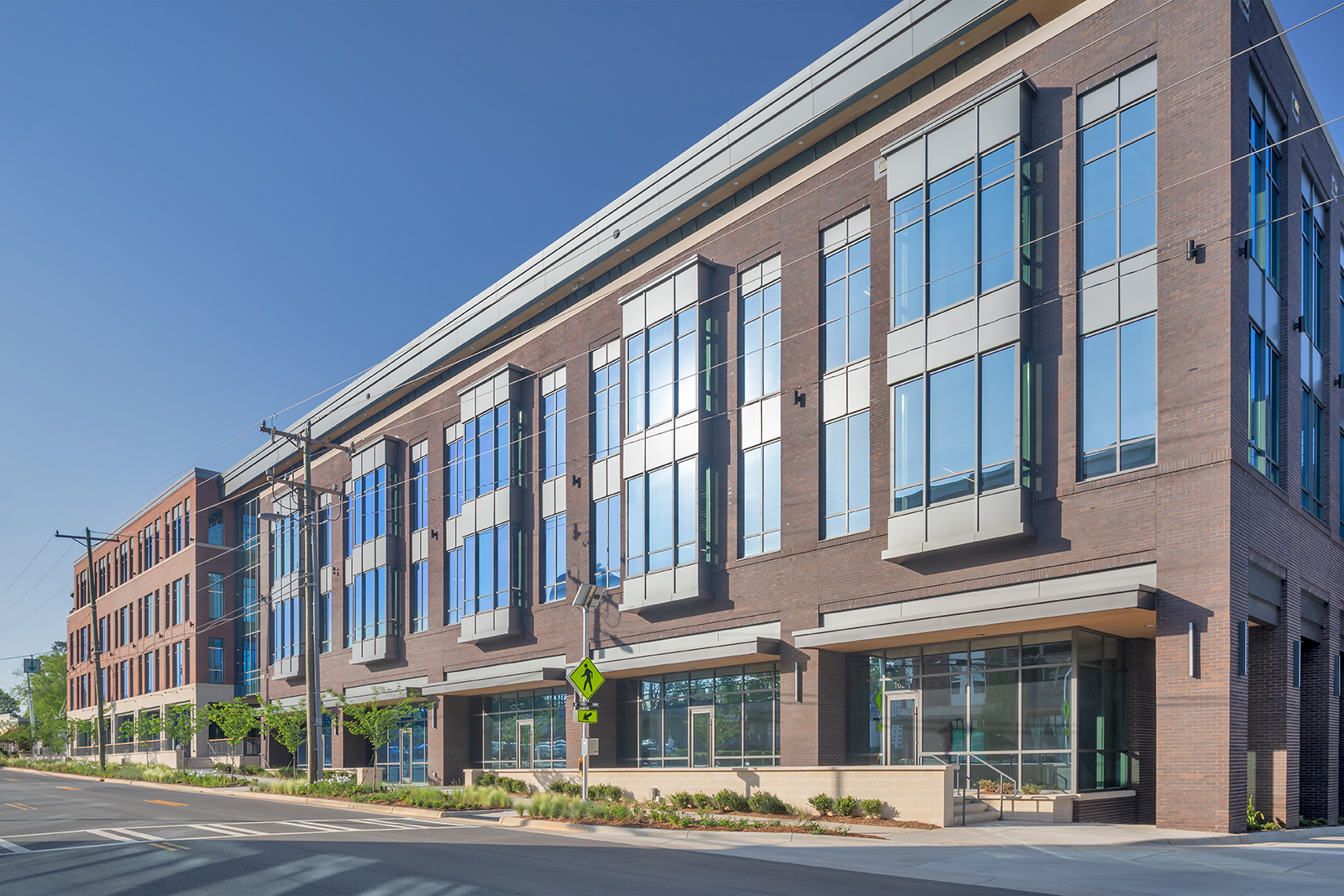
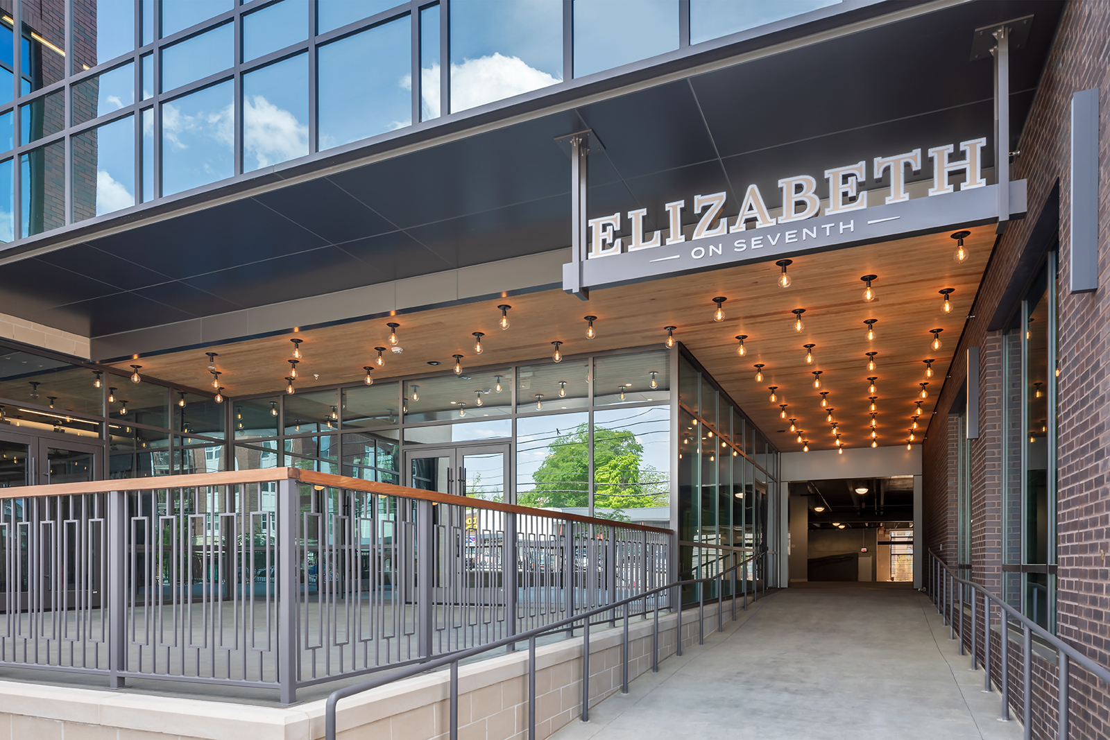
On the 7th Street elevation, the building is similarly broken into sections to mitigate the project’s length and create visual keys in essential areas. The façade is split into two main components that are bisected by a curtainwall to draw attention to the main entry – a central breezeway that leads to the building lobby, an outdoor seating area, and an entrance to the parking deck. At night, this space is illuminated by a cluster of “Edison-style” lights overhead, creating a “marquee” effect. Throughout the project, careful attention was paid to lighting design to minimize light pollution but tastefully accent the building materials at night.
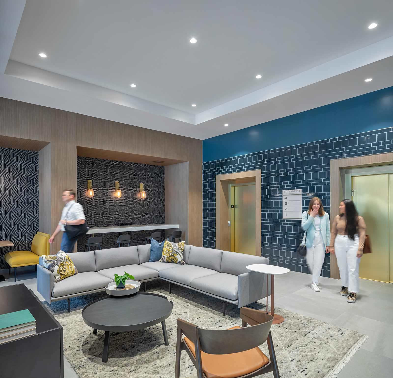
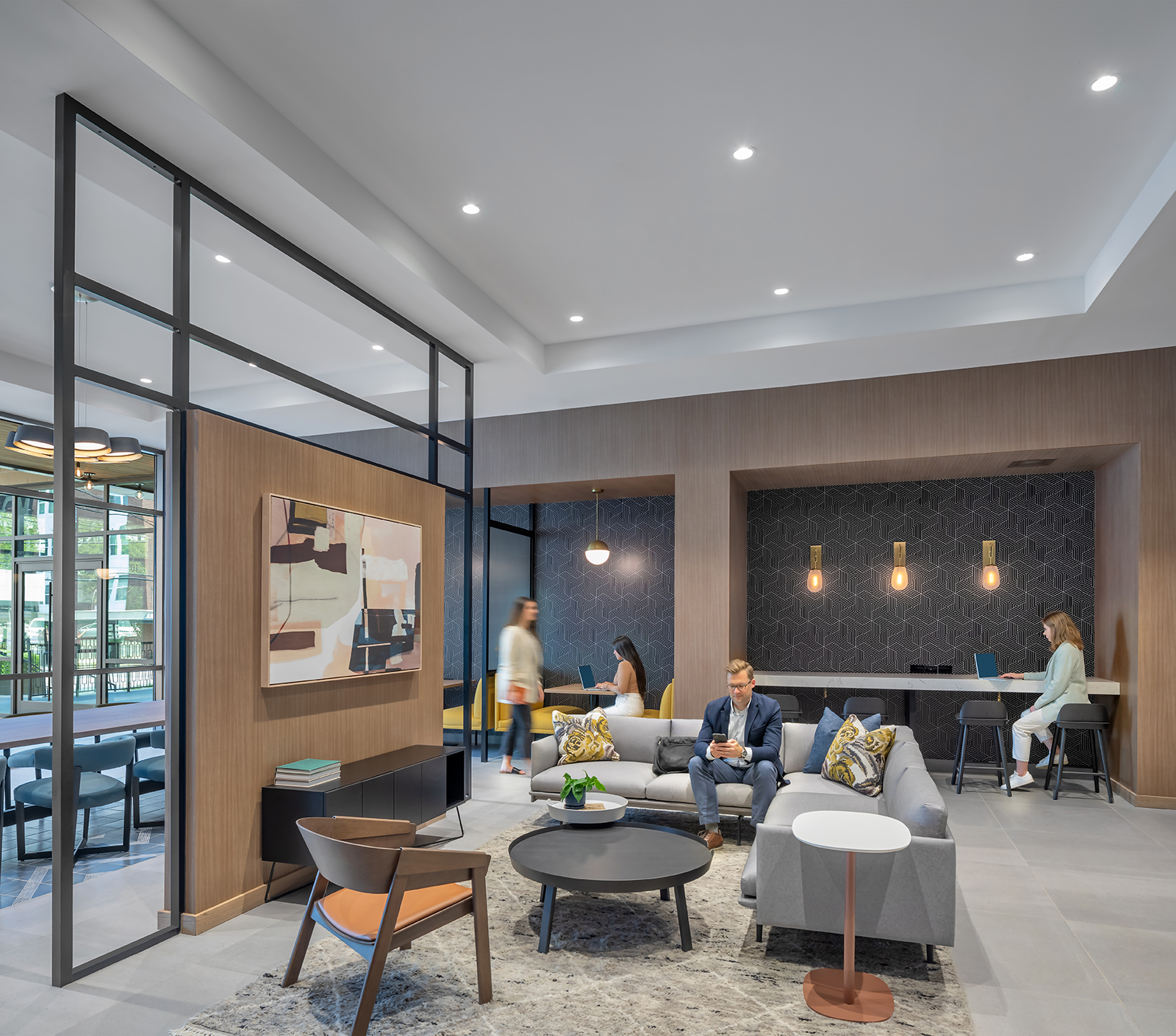
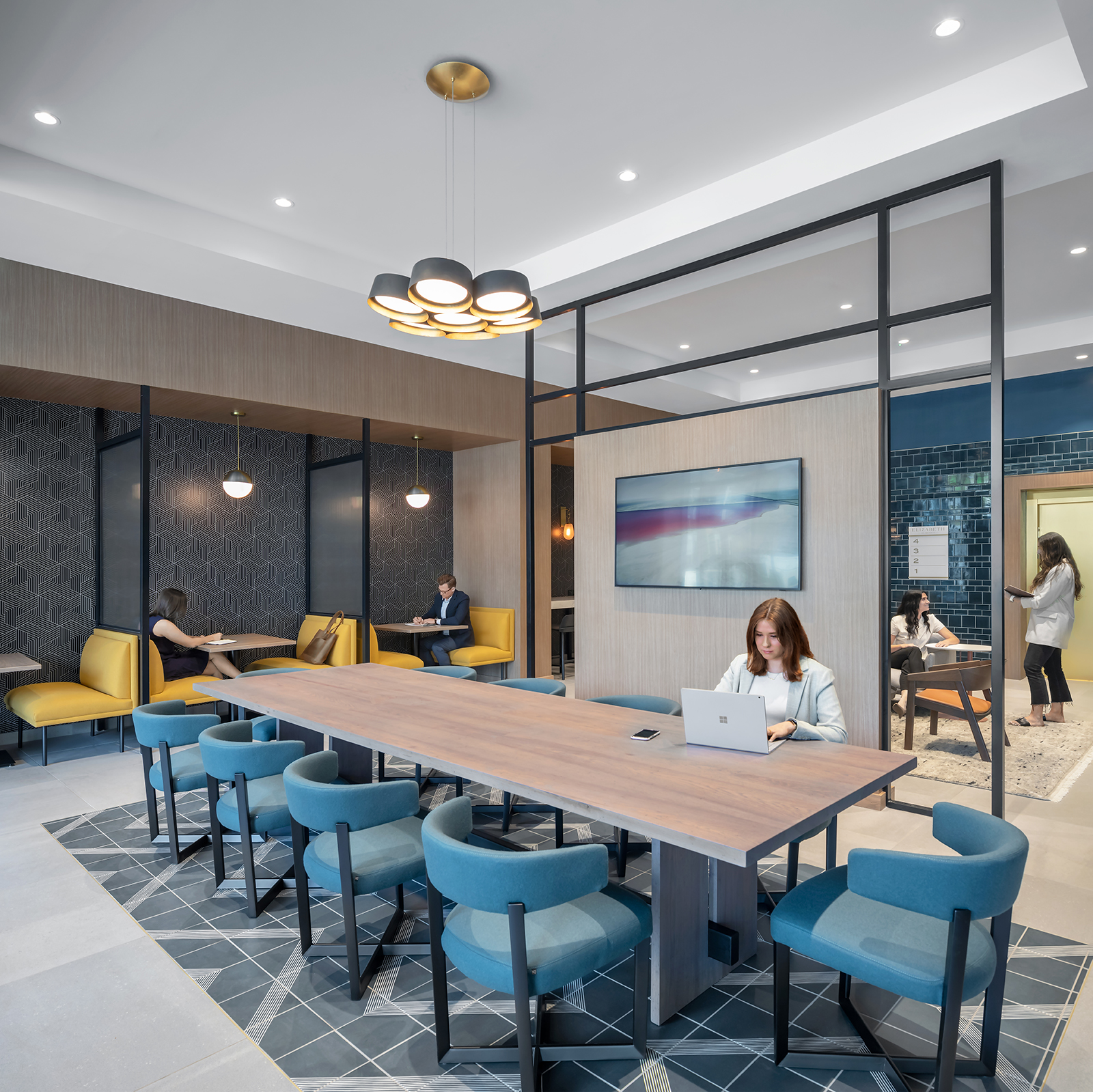
The building lobby, designed as a “jewel box”, is an intentional blend of polished and approachable, with refined materials and relaxed furniture. A large communal table, crafted from trees that felled from the site, is showcased in the front half of the lobby and anchored by a geometric tile inset.
At the streetscape level, a cast stone site wall with a decorative teak rail creates an exterior space outside of the tenant space, and canopies protect storefront entries. Distinctive wall sconces, pilasters with decorative recesses, storefront canopies, custom signage, and plantings also enhance the texture at the pedestrian level. The stepping of this amenity level is another effort to minimize the mass of the building to adjacent properties. A careful balance of building detail and areas of intentionally blank palette for art has created an opportunity for the building to evolve organically over time.
GREEN BUILDING CERTIFICATIONS
+ USGBC LEED SILVER
+ WIRED CERTIFIED
+ FITWELL CERTIFIED
