Carson Station
Carson Station
Project Details
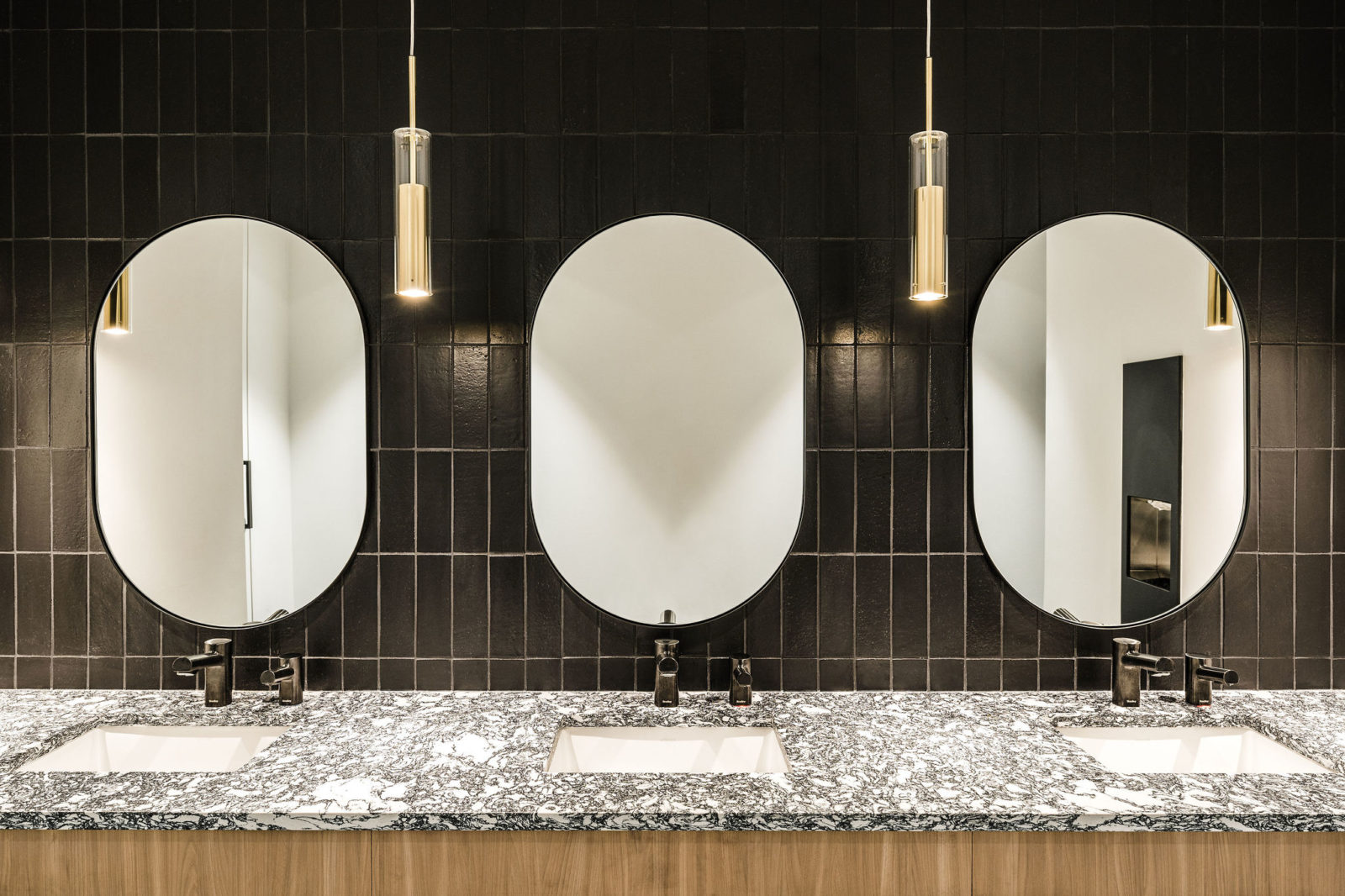
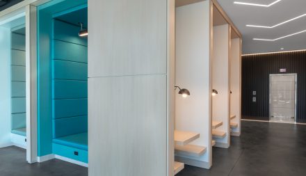
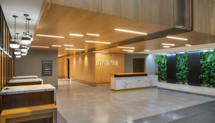
Situated on Morehead Street, the six-story office building formerly known as 1001 Morehead Square was in an identity crisis and in need of a refresh. Just outside Uptown but also on the fringe of South End, the contemporary interiors leaned more towards Uptown corporate but the redevelopment on the surrounding blocks begged for this building to be repositioned to appeal to the South End tenants. The building was acquired by the developer at the end of 2021 with the goal to breathe life into the interiors, focusing on the main building lobby as well as the restrooms and elevator lobbies on the multi-tenant floors. The building was also re-branded as a nod to the light rail station at the base of the building, which will contribute to an expected increase in pedestrian traffic through the building as adjacent properties are developed.
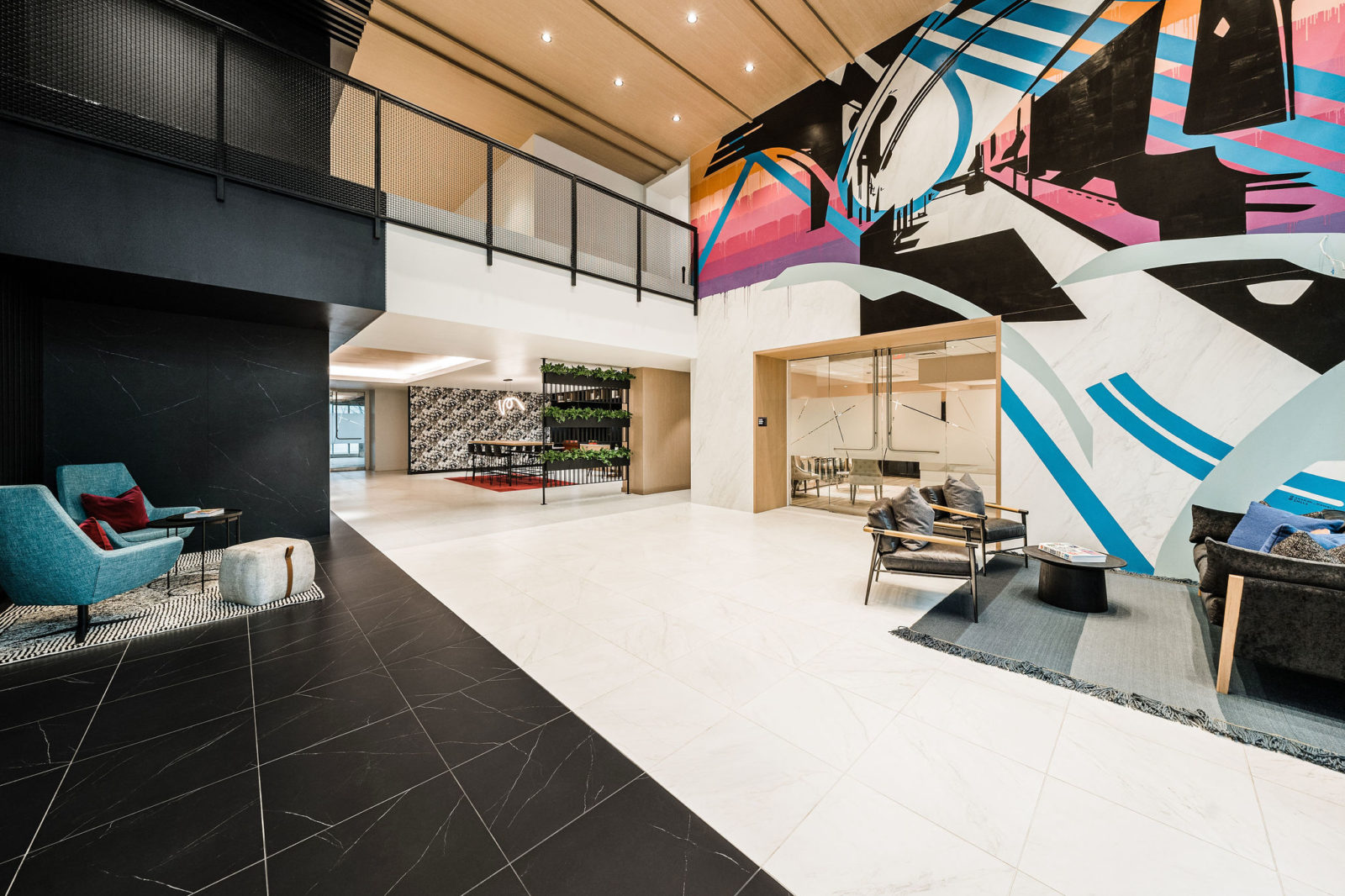
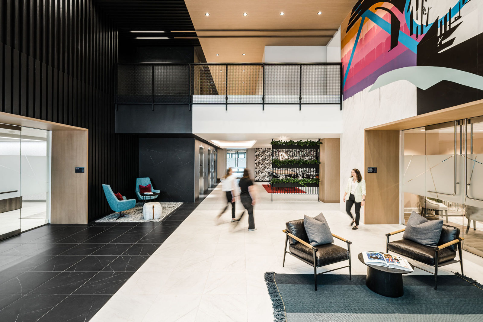
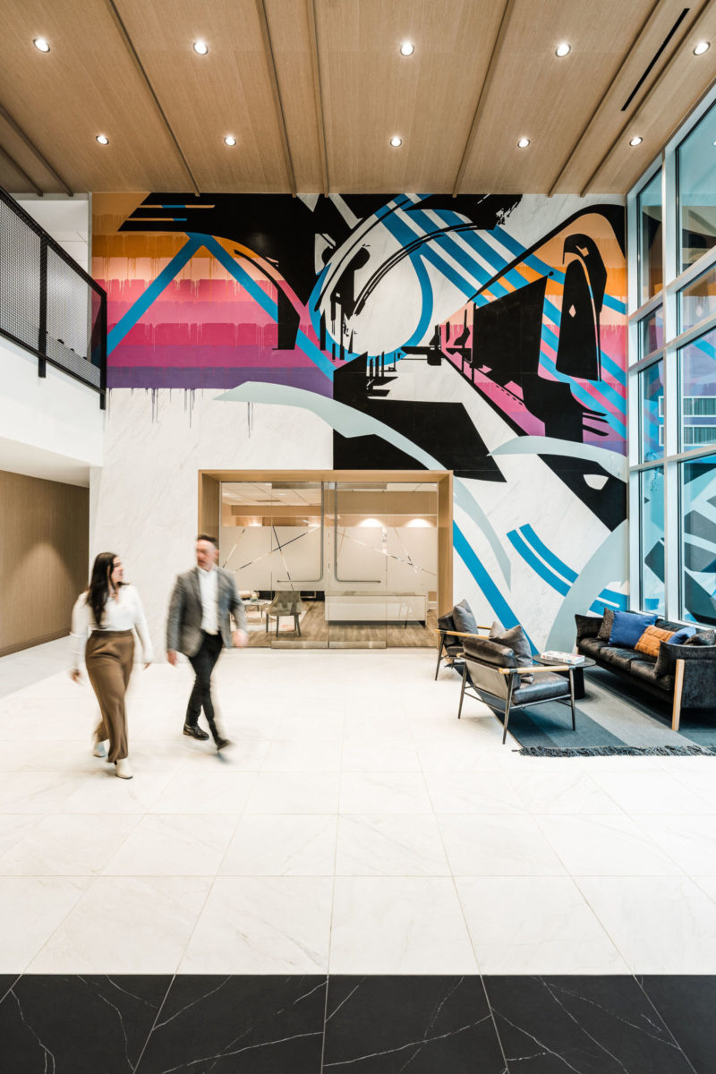
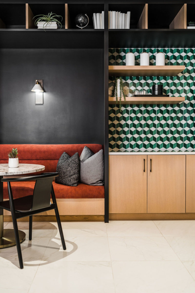
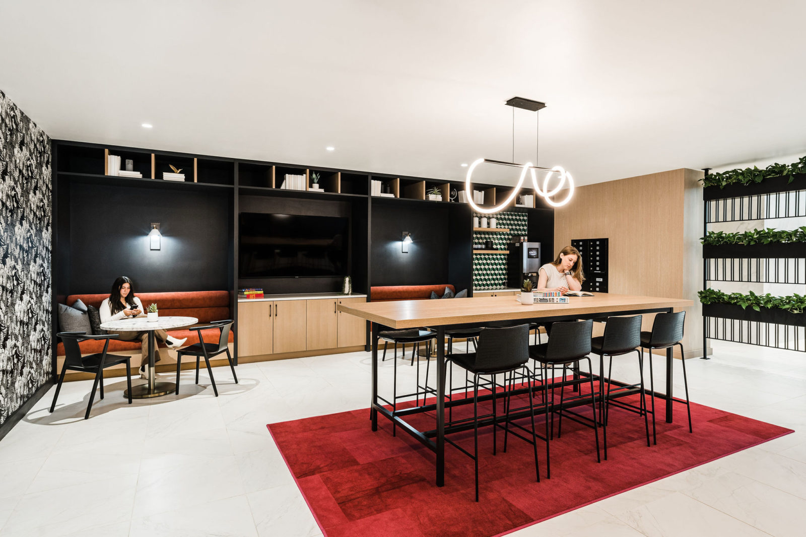
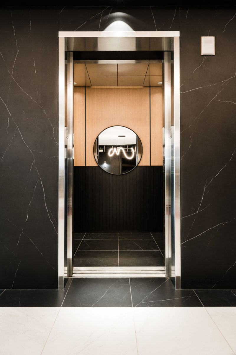
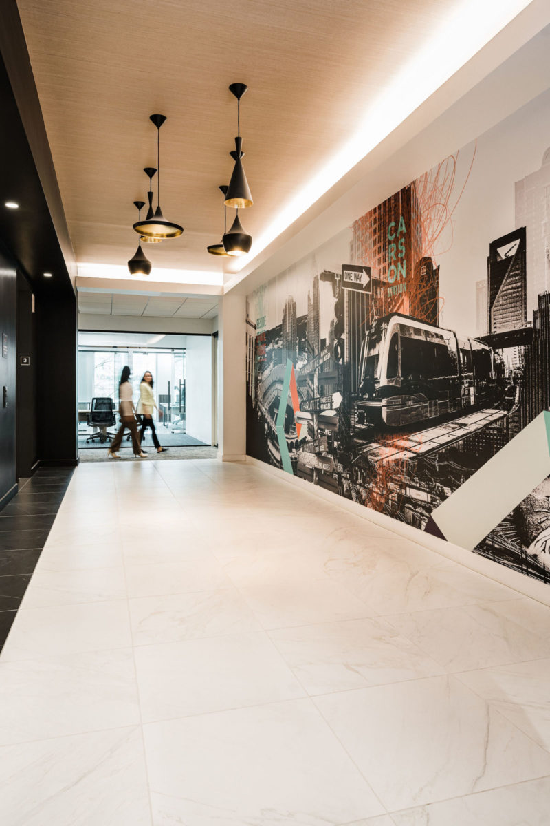
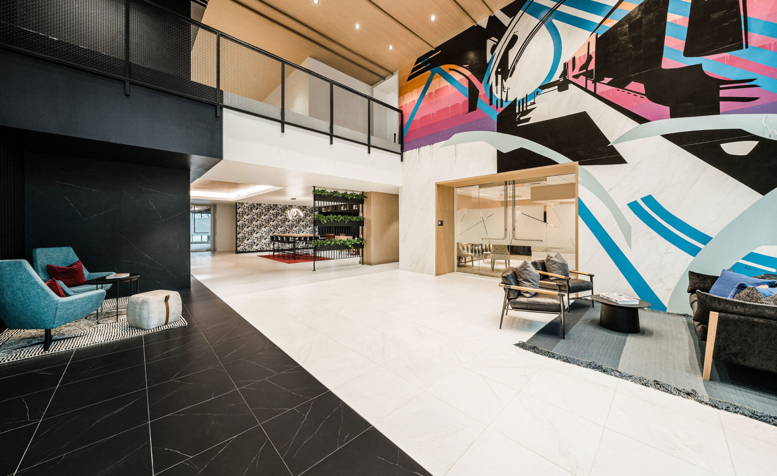
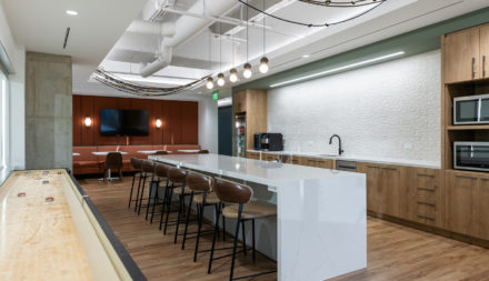
The existing building was poorly programmed for tenant amenities lacking places to gather, work, and socialize as more commonly seen in modern office buildings. The solution converted unutilized space adjacent to the lobby into a tenant lounge that not only provided a third space for tenants, but made the lobby feel larger and more comfortable. Finishes and furnishings were updated in the lobby using a striking palette of high contrast black and white with insertions of wood and colorful upholsteries. A large mural was commissioned for the lobby by two local artists who worked with the design team to develop a graffiti-style aesthetic, using rail imagery to tie back to the re-branded name. The warm palette and lighting temperatures were extended into the multi-tenant floors to provide a better experience from door to door.
With the property on the cusp of two distinct business districts, the existing aesthetic trended more corporate, but the area was moving towards a more young and edgy vibe. The team chose to use the duality of the neighborhoods as the driving concept, using materials and language to strike a collision between the two to speak to the past and the future of the building. The existing marble-look tile was preserved, but local artists were commissioned to graffiti over it with a visual metaphor for “challenging the establishment.” Deep blacks, vibrant colors, and bold patterns & textures accent the space and help move the building toward the next generation’s workforce.
- 2024 CoStar Impact Awards: Redevelopment of the Year – Carson Station
- 2023 IIDA Carolinas Chapter DesignWorks: Honorable Mention Corporate Small
